Using Components
Components are a form-based type of reusable content that simplifies entering information into complex design elements. Components restrict you to entering specific kinds of content, and the formatting is done "behind the scenes." This makes it easier to change the information on design elements with many moving parts, such as slide shows, info cards, and more.
Components can be placed into any editable region inside Modern Campus CMS. Eventually, Components will replace most of our Snippets.
It's important to remember you can insert a component inside a snippet for formatting purposes.
Inserting a Component
Components can be inserted onto pages or other files with editable regions. To add a component to a page:
- Select a page for editing and open the JustEdit Toolbar by editing an editable region.
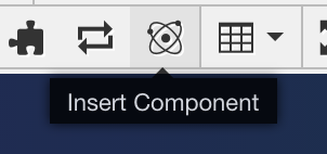
- In the JustEdit Toolbar, place the cursor where the snippet is to be inserted and
click the Insert Component icon.
In the Choose Component modal, select the component and click Insert.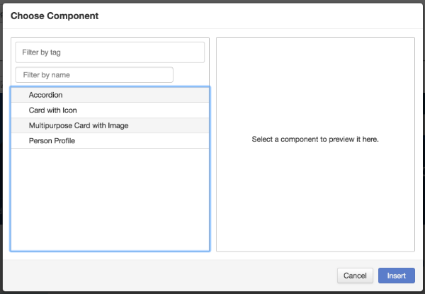
- Fill out the component fields. Anything not marked optional is required, and must be filled out for the component to be placed on the page.
- Click Save. The component is entered into the page with your answers.
- Continue editing the page, or save and publish for your changes to appear on the live site.
Depending on the component settings, you either see the rendered component content, or it displays as a blue placeholder.
Editing Components
Click on a component to either edit the component answers (pencil icon) or delete
it from the page ("x" icon). 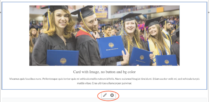
Ones you are done editing - click Save and Exit to view the component on the page.
Tips for Editing Components
We reccomend formatting Components with Multi Column Snippet. Example: if you want to have 5 card components in a row place then inside Multi Column Snippet that has 5 rows, one row for each Component.